After an intensive session of Design Drawing 3, I am relieved the semester is over, and my brief summer has now started. After coming back from a wonderful vacation in Hawaii, I will now give a long but overdue post on my work from Design Drawing 3. I definitely learned a lot from my instructor. Also, there was a bunch of talented upper term transportation design guys in my class, which I greatly learned from technique wise. This class really got me motivated to sketch more everyday.
Anyway, you will have to excuse the chronological order, as blogger has a weird way of uploading. I will try to be brief but descriptive as to what all the daily projects were...
These spaceships were a midterm project, where we had to come up with two space vehicles. The overall goal, was to be able to think on the paper, while communicating your conceptual idea. The first ship was a form inspired by jets and a snake head. Logically, these probably do not fly, but nevertheless, a very fun sketching exercise. Strangely, my weakness is using ballpoint pen, but for some reason, i chose to use it, instead of prisma color pencil for the midterm.


The second design, is an interplanetary ship, able to be amphibious in air and water. Part of the goal of this midterm assignment was to be able to sketch quickly, but also communicate what the components of the design would be, and how it would work. Thus, using partial exploded panels, arrows, and callouts, we communicate our design.


These prisma sketches were done prior to the midterm. I guess they were a warmup of what was to come. Each class, we had to present our ten best concept pages. We had two sessions per week, so I was sketching roughly 30 filled marker pages a week(prsenting only 20) of these assignments. Definately a shock at first, but slowly, I could sort of see improvement.


In the very first class sessions, our instructor gave us many cube exercises to rewarm us up from the intersession break. I actually found them fun and refreshing. I didn't know you could do so much with a cube! The extruded sets you view here, are the cladded versions of cubes. we had to basically make a cube have puzzle like exteriors that were identical on all sides. Sort of an exoskeleton puzzle frame.


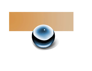
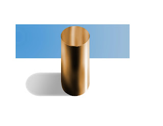
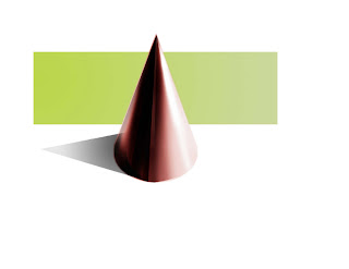
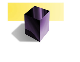
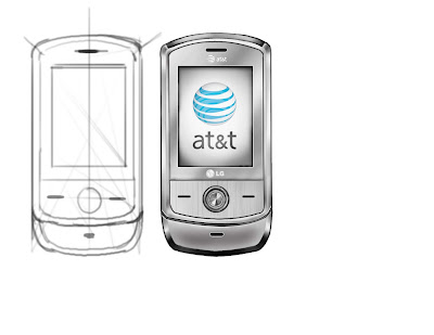
These cubes were more of an exercise of differentiating buttons, partlines, and materials. All had to be done in prisma pencil only.


Anyway, you will have to excuse the chronological order, as blogger has a weird way of uploading. I will try to be brief but descriptive as to what all the daily projects were...
These spaceships were a midterm project, where we had to come up with two space vehicles. The overall goal, was to be able to think on the paper, while communicating your conceptual idea. The first ship was a form inspired by jets and a snake head. Logically, these probably do not fly, but nevertheless, a very fun sketching exercise. Strangely, my weakness is using ballpoint pen, but for some reason, i chose to use it, instead of prisma color pencil for the midterm.
The second design, is an interplanetary ship, able to be amphibious in air and water. Part of the goal of this midterm assignment was to be able to sketch quickly, but also communicate what the components of the design would be, and how it would work. Thus, using partial exploded panels, arrows, and callouts, we communicate our design.
These prisma sketches were done prior to the midterm. I guess they were a warmup of what was to come. Each class, we had to present our ten best concept pages. We had two sessions per week, so I was sketching roughly 30 filled marker pages a week(prsenting only 20) of these assignments. Definately a shock at first, but slowly, I could sort of see improvement.
In the very first class sessions, our instructor gave us many cube exercises to rewarm us up from the intersession break. I actually found them fun and refreshing. I didn't know you could do so much with a cube! The extruded sets you view here, are the cladded versions of cubes. we had to basically make a cube have puzzle like exteriors that were identical on all sides. Sort of an exoskeleton puzzle frame.
These cubes were more of an exercise of differentiating buttons, partlines, and materials. All had to be done in prisma pencil only.


